Visualization with Seaborn#
Matplotlib has been at the core of scientific visualization in Python for decades, but even avid users will admit it often leaves much to be desired. There are several complaints about Matplotlib that often come up:
A common early complaint, which is now outdated: prior to version 2.0, Matplotlib’s color and style defaults were at times poor and looked dated.
Matplotlib’s API is relatively low-level. Doing sophisticated statistical visualization is possible, but often requires a lot of boilerplate code.
Matplotlib predated Pandas by more than a decade, and thus is not designed for use with Pandas
DataFrameobjects. In order to visualize data from aDataFrame, you must extract eachSeriesand often concatenate them together into the right format. It would be nicer to have a plotting library that can intelligently use theDataFramelabels in a plot.
An answer to these problems is Seaborn. Seaborn provides an API on top of Matplotlib that offers sane choices for plot style and color defaults, defines simple high-level functions for common statistical plot types, and integrates with the functionality provided by Pandas.
The difference between matplotlib and seaborn and the need for both is illustrated by the following statement:
If matplotlib tried to make easy things easy and hard things possible, seaborn tried to make a well-defined set of hard things easy too
We’ll take a look at why this is the case.
By convention, Seaborn is often imported as sns:
import warnings
warnings.simplefilter(action='ignore')

%matplotlib inline
import matplotlib.pyplot as plt
import seaborn as sns
import numpy as np
import pandas as pd

sns.set_theme()  # seaborn's method to set its chart style
Exploring Seaborn Plots#
The main idea of Seaborn is that it provides high-level commands to create a variety of plot types useful for statistical data exploration, and even some statistical model fitting.
Let’s take a look at a few of the datasets and plot types available in Seaborn. Note that all of the following could be done using raw Matplotlib commands (this is, in fact, what Seaborn does under the hood), but the Seaborn API is much more convenient.
Histograms, KDE, and Densities#
Often in statistical data visualization, you want to know about the distribution of a variable, or the relation between the distribution of two variables.
What you need in that case is histogram or joint distribution plots.
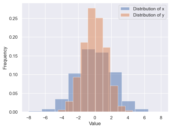
We have seen that this is relatively straightforward in Matplotlib (see the following figure):
data = np.random.multivariate_normal([0, 0], [[5, 2], [2, 2]], size=2000)
data = pd.DataFrame(data, columns=['x', 'y'])
for col in 'xy':
    plt.hist(data[col], density=True, alpha=0.5, label=f"Distribution of {col}")

plt.xlabel('Value')
plt.ylabel('Frequency')
plt.legend()
<matplotlib.legend.Legend at 0x25b746e9610>
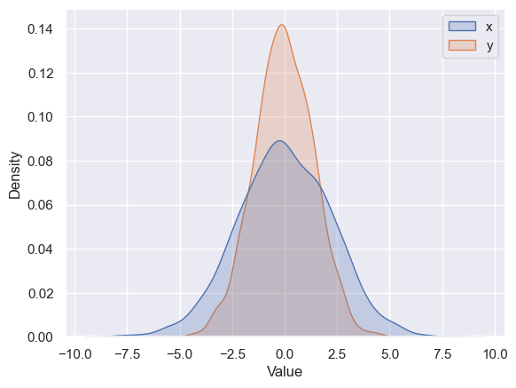
Using seaborn, rather than just providing a histogram as a visual output, we can get a slightly visually appealing and smooth estimate of the distribution using kernel density estimation, with sns.kdeplot (see the following figure):
sns.kdeplot(data=data, fill=True)
plt.xlabel("Value")
Text(0.5, 0, 'Value')
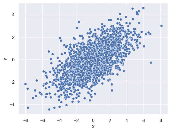
We can plot a scatter plot to see how these variables vary with regards to each other. We use the sns.scatterplot function for the same:
sns.scatterplot(x='x', y='y', data=data)
<Axes: xlabel='x', ylabel='y'>
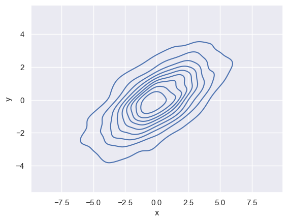
kdeplot can also help us visualise the relation between (or variance) of these two distributions in 2-dimensions along a contour.
If we pass x and y columns to kdeplot, we instead get a two-dimensional visualization of the joint density (see the following figure):
sns.kdeplot(data=data, x='x', y='y')
<Axes: xlabel='x', ylabel='y'>
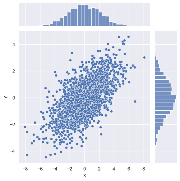
We can see the joint distribution and the marginal distributions together using sns.jointplot
sns.jointplot(x="x", y="y", data=data)
<seaborn.axisgrid.JointGrid at 0x25b788d5f90>
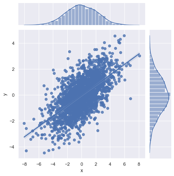
The joint plot can even do some automatic kernel density estimation and regression, as shown in the following figure:
sns.jointplot(x="x", y="y", data=data, kind='reg')
<seaborn.axisgrid.JointGrid at 0x25b78b1c690>
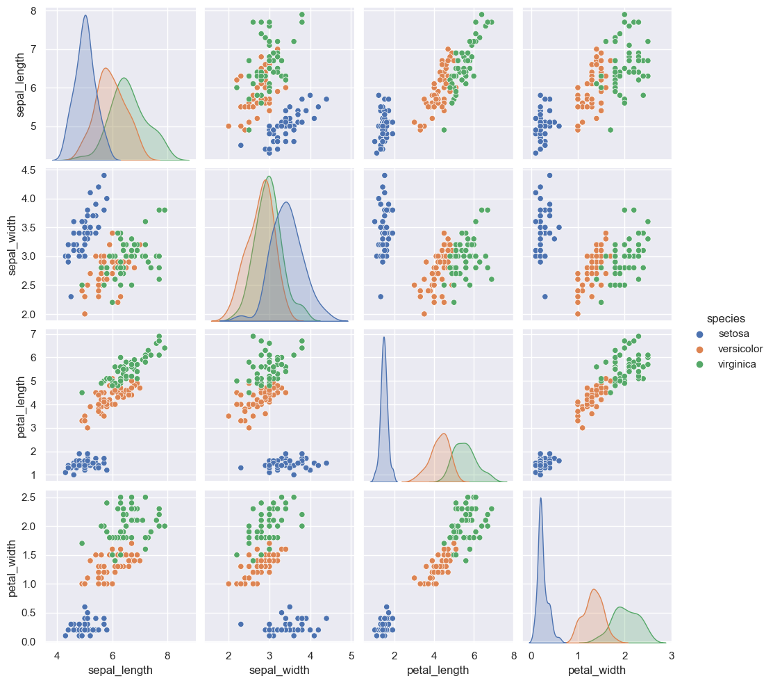
Pair Plots#
When you generalize joint plots to datasets of larger dimensions, you end up with pair plots. These are very useful for exploring correlations between multidimensional data, when you’d like to plot all pairs of values against each other.
We’ll demo this with the well-known Iris dataset, which lists measurements of petals and sepals of three Iris species:
iris = sns.load_dataset("iris")
iris.head()
| sepal_length | sepal_width | petal_length | petal_width | species | |
|---|---|---|---|---|---|
| 0 | 5.1 | 3.5 | 1.4 | 0.2 | setosa |
| 1 | 4.9 | 3.0 | 1.4 | 0.2 | setosa |
| 2 | 4.7 | 3.2 | 1.3 | 0.2 | setosa |
| 3 | 4.6 | 3.1 | 1.5 | 0.2 | setosa |
| 4 | 5.0 | 3.6 | 1.4 | 0.2 | setosa |
Visualizing the multidimensional relationships among the samples is as easy as calling sns.pairplot (see the following figure):
sns.pairplot(iris, hue='species', height=2.5)
<seaborn.axisgrid.PairGrid at 0x25b78ef3a50>
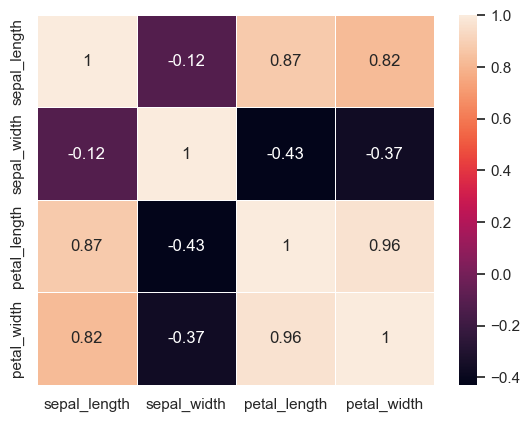
Correlations and Heatmaps#
A much more concise visualization of the above kind (that gives us a feel for the relationship between the distribution of different variables in the dataset) would be to plot a heatmap using the correlations between different variables. We can do that using the sns.heatmap function.
NOTE: We can only do this for numerical variables
sns.heatmap(iris[['sepal_length', 'sepal_width', 'petal_length', 'petal_width']].corr(), cbar=True, linewidths=0.5, annot=True)
<Axes: >
Faceted Histograms#
Sometimes the best way to view data is via histograms of subsets. Basically, if you have two categorical variables at 2 levels each, you can have 4 combinations of the levels. What we want to visualiza then is the distribution of each combination of the different levels and variables.
Seaborn’s FacetGrid makes this simple.
We’ll take a look at some data that shows the amount that restaurant staff receive in tips based on various indicator data:[*]
[*]: The restaurant staff data used in this section divides employees into two sexes: female and male. Biological sex isn’t binary, but the following discussion and visualizations are limited by this data.
tips = sns.load_dataset('tips')
tips.head()
| total_bill | tip | sex | smoker | day | time | size | |
|---|---|---|---|---|---|---|---|
| 0 | 16.99 | 1.01 | Female | No | Sun | Dinner | 2 |
| 1 | 10.34 | 1.66 | Male | No | Sun | Dinner | 3 |
| 2 | 21.01 | 3.50 | Male | No | Sun | Dinner | 3 |
| 3 | 23.68 | 3.31 | Male | No | Sun | Dinner | 2 |
| 4 | 24.59 | 3.61 | Female | No | Sun | Dinner | 4 |
tips['tip_pct'] = 100 * tips['tip'] / tips['total_bill']
tips.head()
| total_bill | tip | sex | smoker | day | time | size | tip_pct | |
|---|---|---|---|---|---|---|---|---|
| 0 | 16.99 | 1.01 | Female | No | Sun | Dinner | 2 | 5.944673 |
| 1 | 10.34 | 1.66 | Male | No | Sun | Dinner | 3 | 16.054159 |
| 2 | 21.01 | 3.50 | Male | No | Sun | Dinner | 3 | 16.658734 |
| 3 | 23.68 | 3.31 | Male | No | Sun | Dinner | 2 | 13.978041 |
| 4 | 24.59 | 3.61 | Female | No | Sun | Dinner | 4 | 14.680765 |
grid = sns.FacetGrid(tips, row="sex", col="time", margin_titles=True)
grid.map(plt.hist, "tip_pct", bins=np.linspace(0, 40, 15))
<seaborn.axisgrid.FacetGrid at 0x25b79dd8b10>
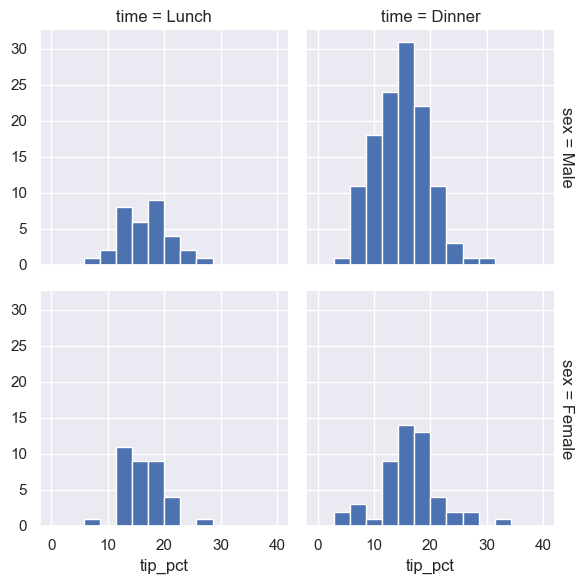
The faceted chart gives us some quick insights into the dataset: for example, we see that it contains far more data on male servers during the dinner hour than other categories, and typical tip amounts appear to range from approximately 10% to 20%, with some outliers on either end.
Categorical Plots#
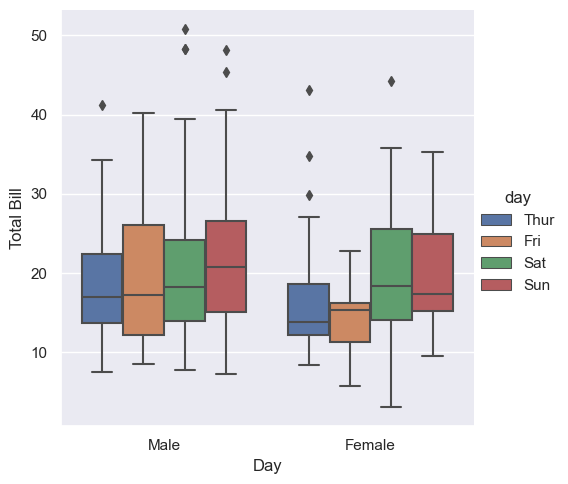
Categorical plots can be useful for this kind of visualization as well. These allow you to view the distribution of a numerical parameter in an axis defined by any other categorical parameter, separated using a third categorical variable, as shown in the following figure:
g = sns.catplot(x="sex", y="total_bill", hue="day", data=tips, kind="box")
g.set_axis_labels("Day", "Total Bill")
<seaborn.axisgrid.FacetGrid at 0x25b79f92450>
In the following example, we’ll use the Planets dataset.
It contains different informations regarding different planets discovered over past years such as, method of discovery, orbital period, mass, year of discovery and so on.
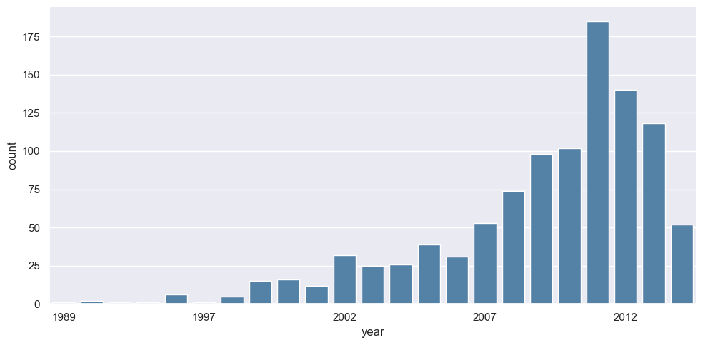
Let’s say, we want to visualize how many planets were discovered across different years, we can easily do that using a barplot where the height of the bar represents the number of planets discovered in that particular year. sns.catplot allows us to do that.
planets = sns.load_dataset('planets')
planets.head()
| method | number | orbital_period | mass | distance | year | |
|---|---|---|---|---|---|---|
| 0 | Radial Velocity | 1 | 269.300 | 7.10 | 77.40 | 2006 |
| 1 | Radial Velocity | 1 | 874.774 | 2.21 | 56.95 | 2008 |
| 2 | Radial Velocity | 1 | 763.000 | 2.60 | 19.84 | 2011 |
| 3 | Radial Velocity | 1 | 326.030 | 19.40 | 110.62 | 2007 |
| 4 | Radial Velocity | 1 | 516.220 | 10.50 | 119.47 | 2009 |
g = sns.catplot(x="year", data=planets, aspect=2,
                kind="count", color='steelblue')
g.set_xticklabels(step=5)
<seaborn.axisgrid.FacetGrid at 0x25b7b9b7710>
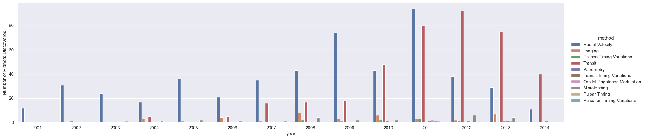
We can learn more by looking at the method of discovery of each of these planets (see the following figure):
g = sns.catplot(x="year", data=planets, aspect=4.0, kind='count',
                hue='method', order=range(2001, 2015))
g.set_ylabels('Number of Planets Discovered')
<seaborn.axisgrid.FacetGrid at 0x25b7ba9d310>
For more information on plotting with Seaborn, see the Seaborn documentation, and particularly the example gallery.