Seaborn Demo on a complete dataset#
Data visualization and exploration using the mtcars dataset#
The mtcars dataset consists of data extracted from the 1974 Motor Trend US magazine, and comprises of fuel consumption and 10 aspects of automobile design and performance for 32 automobiles (1973-74 models).
import warnings
warnings.simplefilter(action='ignore')

import numpy as np
import pandas as pd
import seaborn as sns
import matplotlib.pyplot as plt
%matplotlib inline
mtcars = pd.read_csv('mtcars.csv')
mtcars.head()
| model | mpg | cyl | disp | hp | drat | wt | qsec | vs | am | gear | carb | |
|---|---|---|---|---|---|---|---|---|---|---|---|---|
| 0 | Mazda RX4 | 21.0 | 6 | 160.0 | 110 | 3.90 | 2.620 | 16.46 | 0 | 1 | 4 | 4 |
| 1 | Mazda RX4 Wag | 21.0 | 6 | 160.0 | 110 | 3.90 | 2.875 | 17.02 | 0 | 1 | 4 | 4 |
| 2 | Datsun 710 | 22.8 | 4 | 108.0 | 93 | 3.85 | 2.320 | 18.61 | 1 | 1 | 4 | 1 |
| 3 | Hornet 4 Drive | 21.4 | 6 | 258.0 | 110 | 3.08 | 3.215 | 19.44 | 1 | 0 | 3 | 1 |
| 4 | Hornet Sportabout | 18.7 | 8 | 360.0 | 175 | 3.15 | 3.440 | 17.02 | 0 | 0 | 3 | 2 |
The data frame consists of the following rows:
mpg: miles/gallon
cyl: number of cylinders
disp: displacement in cubic inches
hp: gross horsepower
drat - rear axle ratio
wt - weight of car in pounds (wt * 100 pounds)
qsec - 1/4 mile time
vs - type of engine (v shaped or straight)
am - transmission (1 - manual, 0 - automatic)
gear - no of gears
carb - no of carburettors
We will first set the model column as the index for the dataset, so we can access rows using the model names if we want later on.
mtcars.set_index('model', inplace=True)
mtcars.head()
| mpg | cyl | disp | hp | drat | wt | qsec | vs | am | gear | carb | |
|---|---|---|---|---|---|---|---|---|---|---|---|
| model | |||||||||||
| Mazda RX4 | 21.0 | 6 | 160.0 | 110 | 3.90 | 2.620 | 16.46 | 0 | 1 | 4 | 4 |
| Mazda RX4 Wag | 21.0 | 6 | 160.0 | 110 | 3.90 | 2.875 | 17.02 | 0 | 1 | 4 | 4 |
| Datsun 710 | 22.8 | 4 | 108.0 | 93 | 3.85 | 2.320 | 18.61 | 1 | 1 | 4 | 1 |
| Hornet 4 Drive | 21.4 | 6 | 258.0 | 110 | 3.08 | 3.215 | 19.44 | 1 | 0 | 3 | 1 |
| Hornet Sportabout | 18.7 | 8 | 360.0 | 175 | 3.15 | 3.440 | 17.02 | 0 | 0 | 3 | 2 |
We use the info function to get more information about the different columns in the dataset
mtcars.info()
<class 'pandas.core.frame.DataFrame'>
Index: 32 entries, Mazda RX4 to Volvo 142E
Data columns (total 11 columns):
 #   Column  Non-Null Count  Dtype
---  ------  --------------  -----
 0   mpg     32 non-null     float64
 1   cyl     32 non-null     int64
 2   disp    32 non-null     float64
 3   hp      32 non-null     int64
 4   drat    32 non-null     float64
 5   wt      32 non-null     float64
 6   qsec    32 non-null     float64
 7   vs      32 non-null     int64
 8   am      32 non-null     int64
 9   gear    32 non-null     int64
 10  carb    32 non-null     int64
dtypes: float64(5), int64(6)
memory usage: 3.0+ KB
mtcars.shape
(32, 11)
We have a lot of variables, and there can be so many interesting relationships we can visualize and try to figure out.
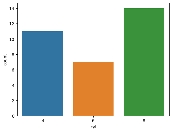
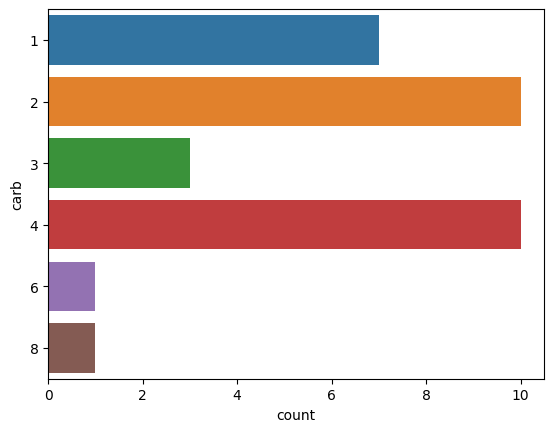
First of all, we can use a basic countplot to see if there is a certain trend in the cars produced, e.g., do most cars have 6 cylinders or do they have 4 carburettors?
res = sns.countplot(x='cyl', data=mtcars)
sns.countplot(y='carb', data=mtcars)
<Axes: xlabel='count', ylabel='carb'>
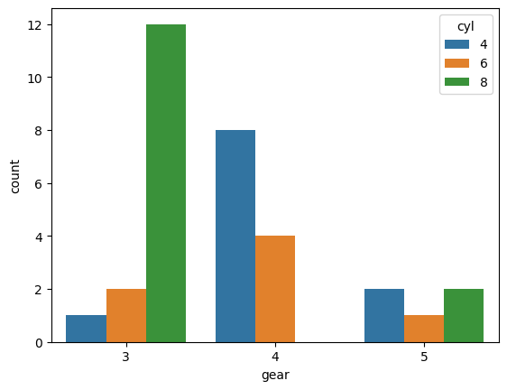
we can also visualize easily, proportions of different variables with relation to other variables.
For example, if we want to see if cars with 4 gears are more likely to have 4 cylinders, or if cars with 3 gears have 6 cylinders in general?
sns.countplot(x='gear', hue='cyl', data=mtcars)
<Axes: xlabel='gear', ylabel='count'>
Another simple thing to look at would be the distribution of some variable. Mileage looks like the most interesting variable for a car, so we will go ahead and just make a histogram for mileage:
sns.histplot(mtcars.mpg, bins=10, color='b')
<Axes: xlabel='mpg', ylabel='Count'>
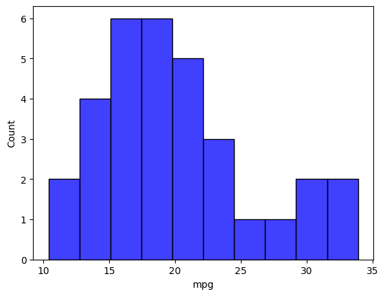
We see that most vehicles have a mileage around 17 mpg, however there are a few cars that provide very high mileage (around 35 mpg).
This is just about one variable, we can look at multiple variables and their relationships. For example, we want to figure out if the number of cylinders affects the mileage. Its a reasonable guess, but how to visualize? We can use a scatterplot to plot both variables.
res = sns.scatterplot(data=mtcars, x='cyl', y='mpg')
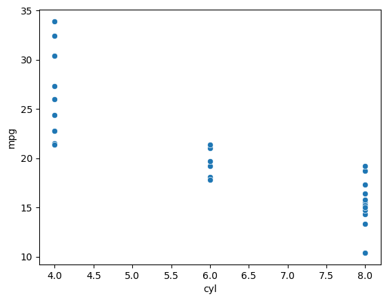
We can see that there is a decreasing trend in general, as the number of cylinders increase, the mileage goes down.
However, since our x axis (cyl) is discrete, the points in the plots above line up, and its not really easy to make sense of anything regarding the distribution of points.
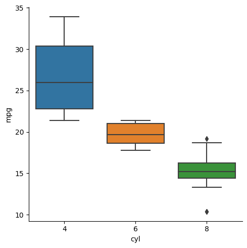
We can visualize this relationship better using a boxplot.
res = sns.catplot(data=mtcars, x='cyl', y='mpg', kind='box')
Next question can be, does the mode of transmission affect the mileage? Is an automatic system more efficient?
sns.catplot(x='am', y='mpg', data=mtcars, kind='box')
<seaborn.axisgrid.FacetGrid at 0x16d5ab0c1d0>
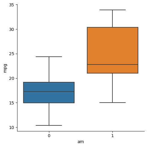
Looks like transmission also affects mileage, but it might not be a very good predictor of mileage, since there is a lot of variance and overlap between both the boxplots presented above (unlike the case for number of cylinders).
However, what if we want to know what all different variables affect the mileage?
We can make individual plots of each variable vs the mileage, or we can use seaborn to simplify our lives and just make one pairplot:
sns.pairplot(mtcars)
<seaborn.axisgrid.PairGrid at 0x16d5ab026d0>
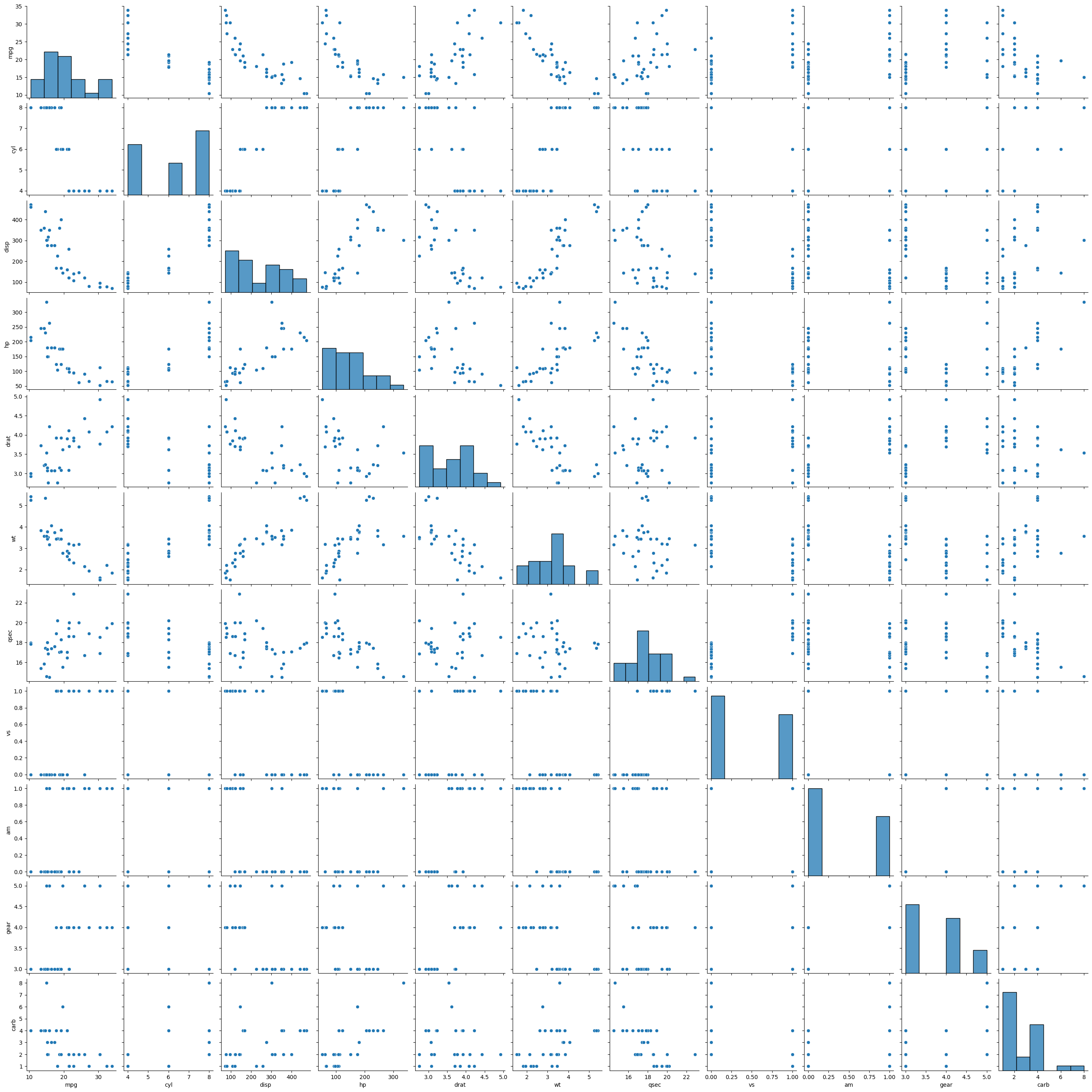
Given the number of variables, it is really difficult to visualize or find relationships between different variables. What to do?
We can get over this issue by making a heatmap of different variables.
We can then use scatter plots or joint plots to look at variables we are interested in.
sns.heatmap(mtcars.corr(), cbar=True, linewidths=0.5, annot=True)
<Axes: >
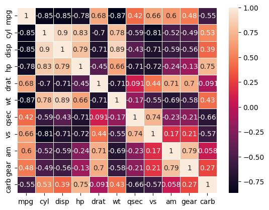
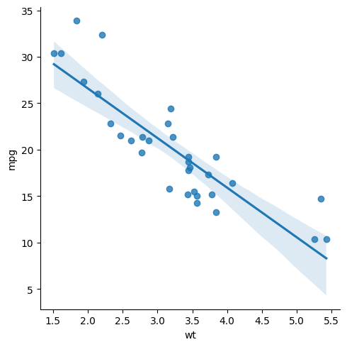
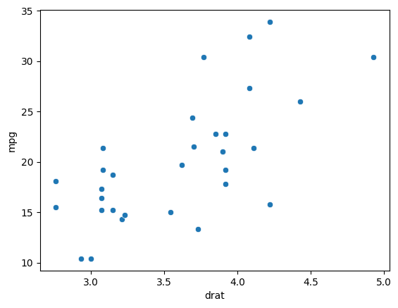
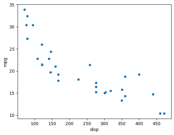
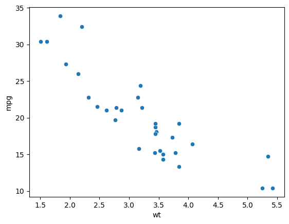
It looks like mileage is highly negatively correlated with the displacement and weight, both of which are numeric variables. It also has a high positive correlation with drat which is again a numeric variable.
sns.scatterplot(x='drat', y='mpg', data=mtcars)
<Axes: xlabel='drat', ylabel='mpg'>
sns.scatterplot(x='disp', y='mpg', data=mtcars)
<Axes: xlabel='disp', ylabel='mpg'>
sns.scatterplot(x='wt', y='mpg', data=mtcars)
<Axes: xlabel='wt', ylabel='mpg'>
Now, we can think of doing regressions or using these variables to predict the value of mileage of a car given its different features.
We will be learning more about regression, modelling, and other data science techniques in the next module when we learn about sci-kit learn.
As a teaser, given below is a simple visualization for regression carried out on the variables weights and mileage.
sns.lmplot(x='wt', y='mpg', data=mtcars)
<seaborn.axisgrid.FacetGrid at 0x16d63698cd0>